Little Ducklings
Creative Strategy
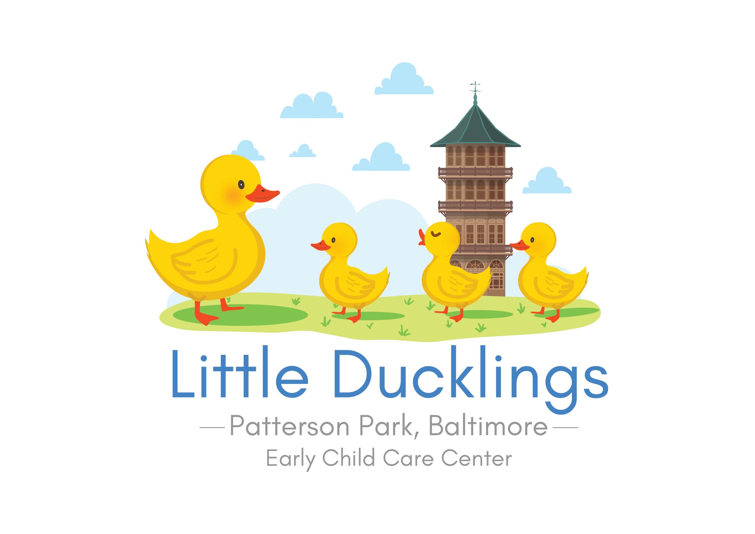
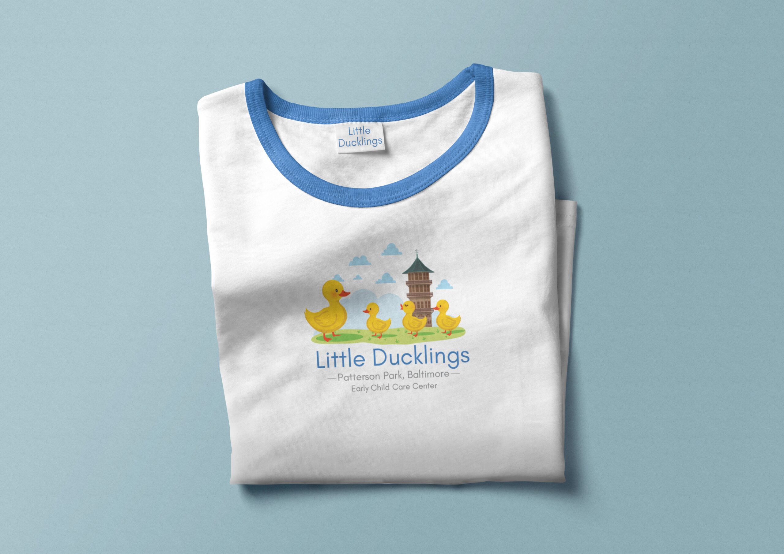
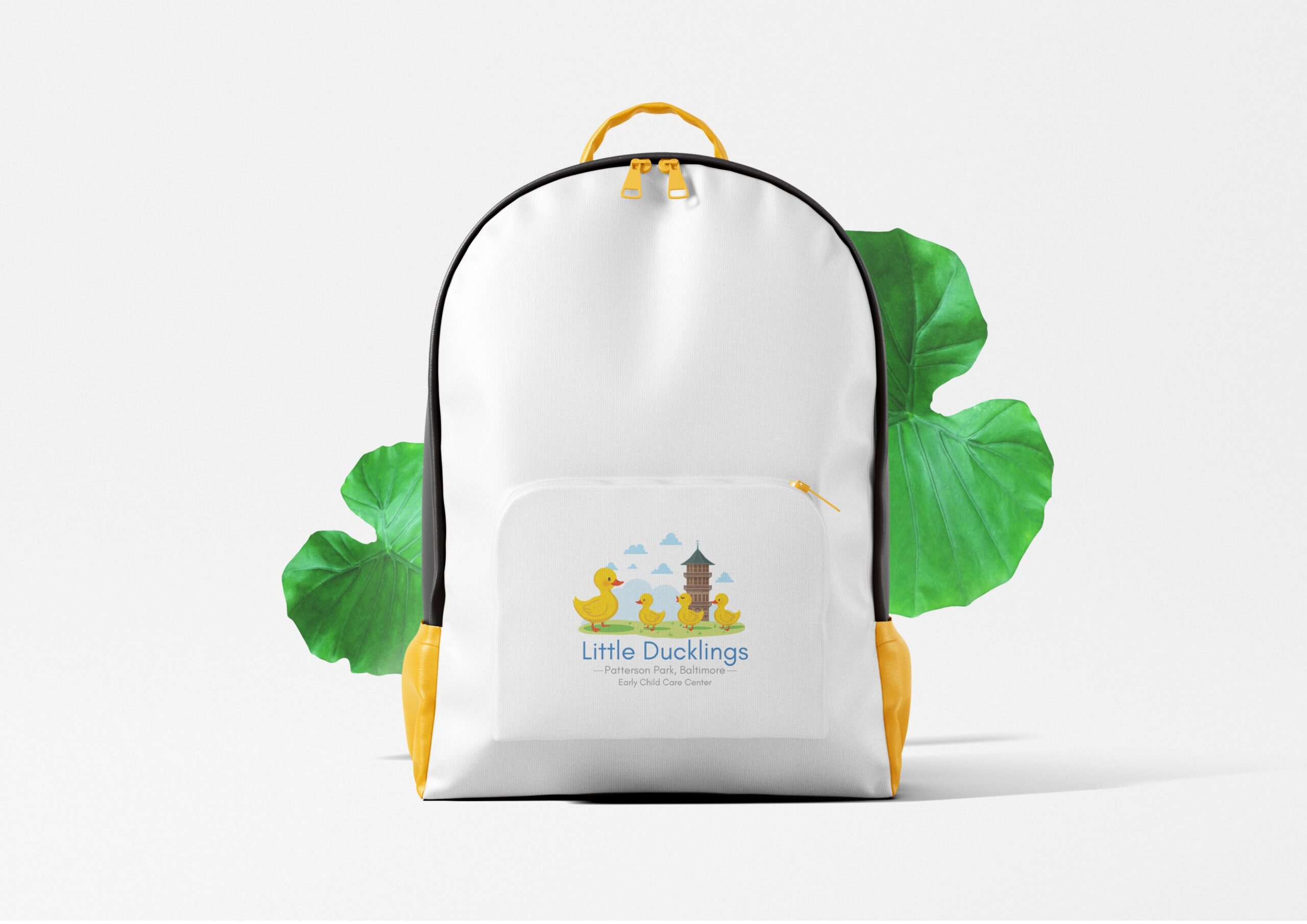
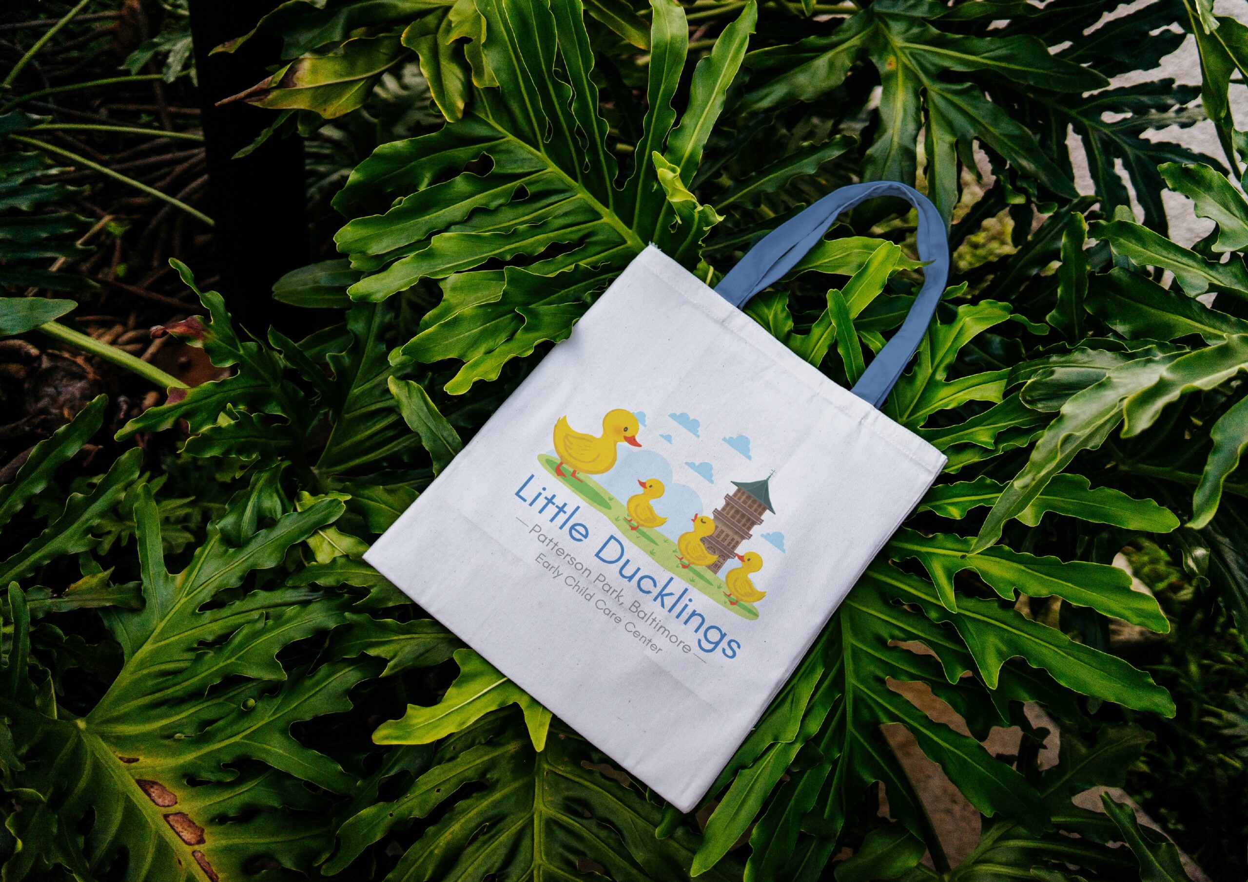
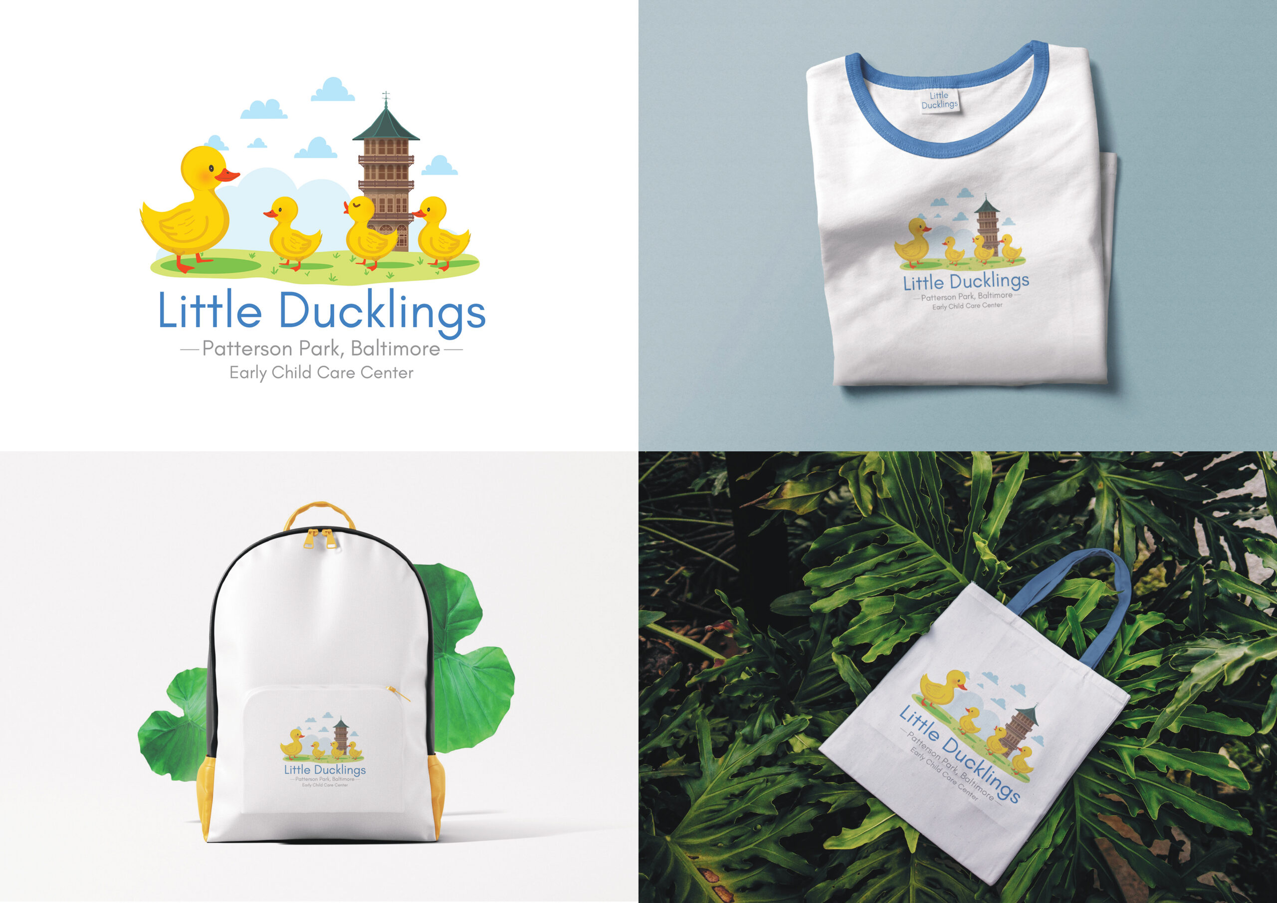
Little Ducklings is a visual identity project for an early childhood care center in Patterson Park, Baltimore, designed around the ideas of childhood, care, playfulness, and community. The identity combines a friendly family of ducklings with a recognizable architectural reference to Patterson Park, creating a visual story that connects the center to its local surroundings. We developed the identity and extended it across branded merchandise and physical applications, including T-shirts, backpacks, and tote bags. The overall direction uses bright, welcoming illustrations and a soft color palette to create an approachable identity that feels joyful and child-friendly.
The challenge was to create an identity that would appeal to young children while also communicating trust, warmth, safety, and professionalism to parents. The visual language needed to feel playful without becoming overly childish, and the connection to Patterson Park needed to be recognizable without overwhelming the central duckling concept. Another important challenge was ensuring that the identity could work consistently across different physical applications, from the primary logo to clothing, bags, and promotional materials.
We created a custom illustrated identity centered around a mother duck and her ducklings, symbolizing care, growth, togetherness, and a nurturing environment. Patterson Park’s architectural character was incorporated into the illustration to give the identity a strong sense of place and community. A bright combination of blue, yellow, green, and neutral tones was used to create a cheerful and welcoming visual language. The identity was then adapted across T-shirts, backpacks, tote bags, and other brand applications, creating a cohesive system that feels playful, recognizable, and memorable while maintaining a professional presence.
© 2026 Kohinoor Studios — Crafted with purpose, designed to be remembered.