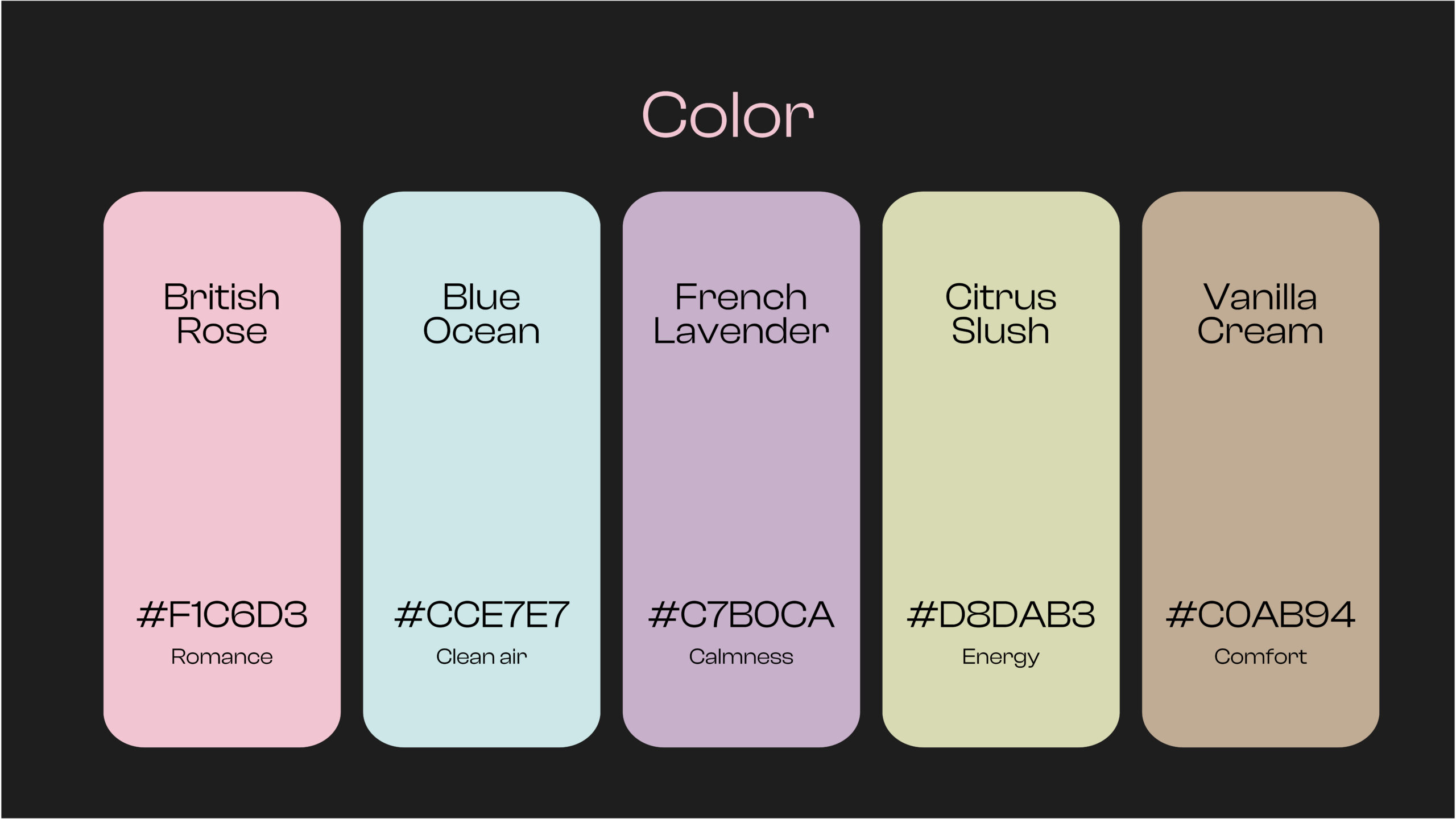
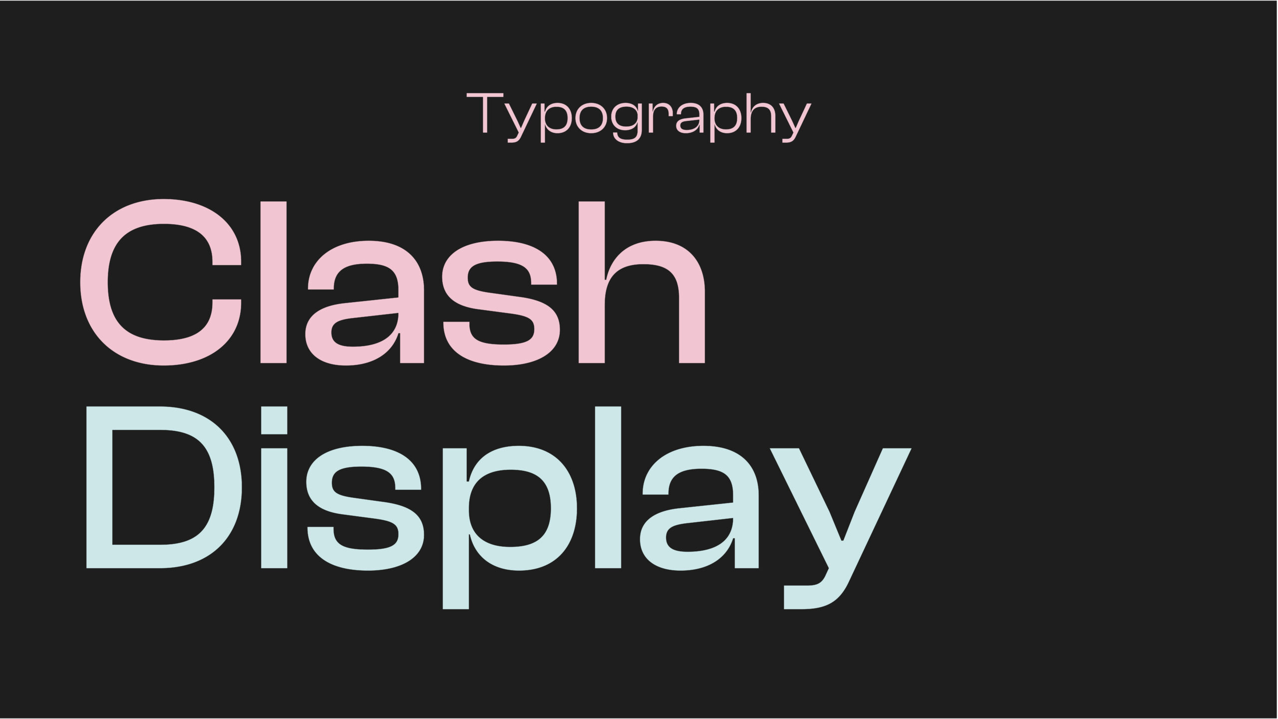
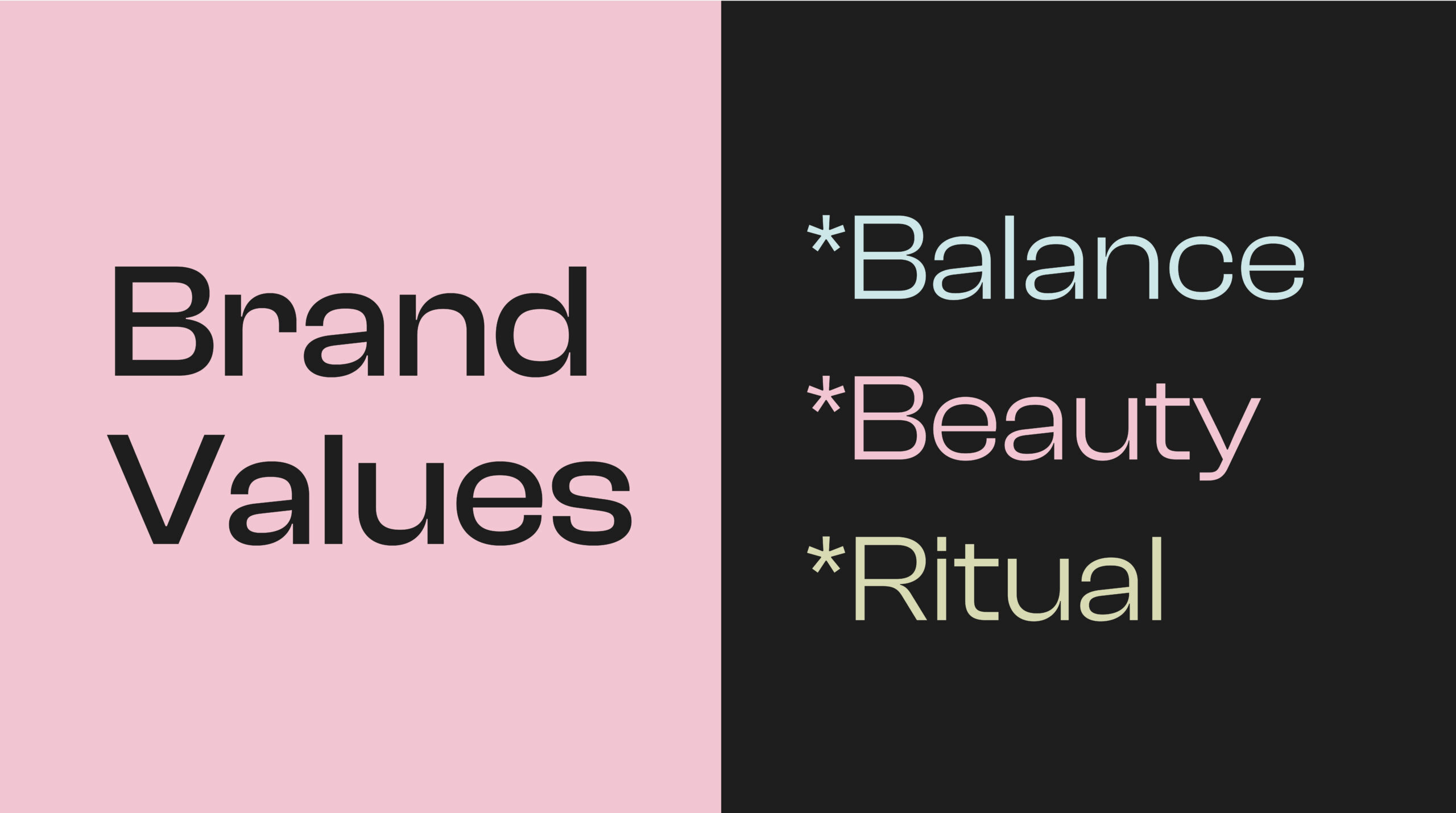
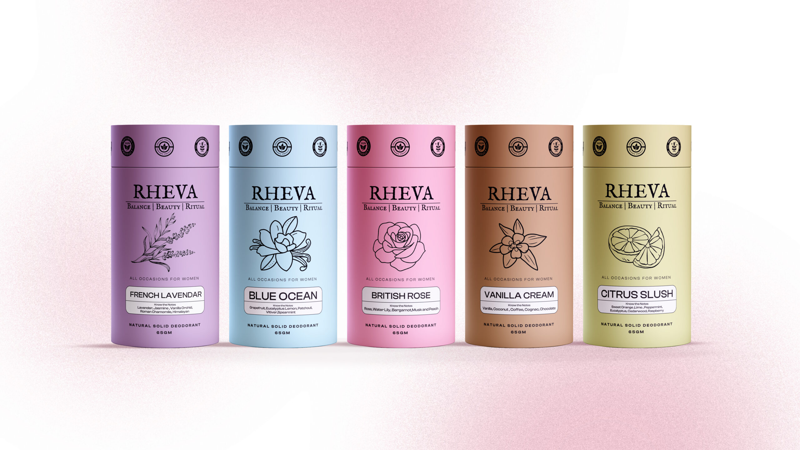
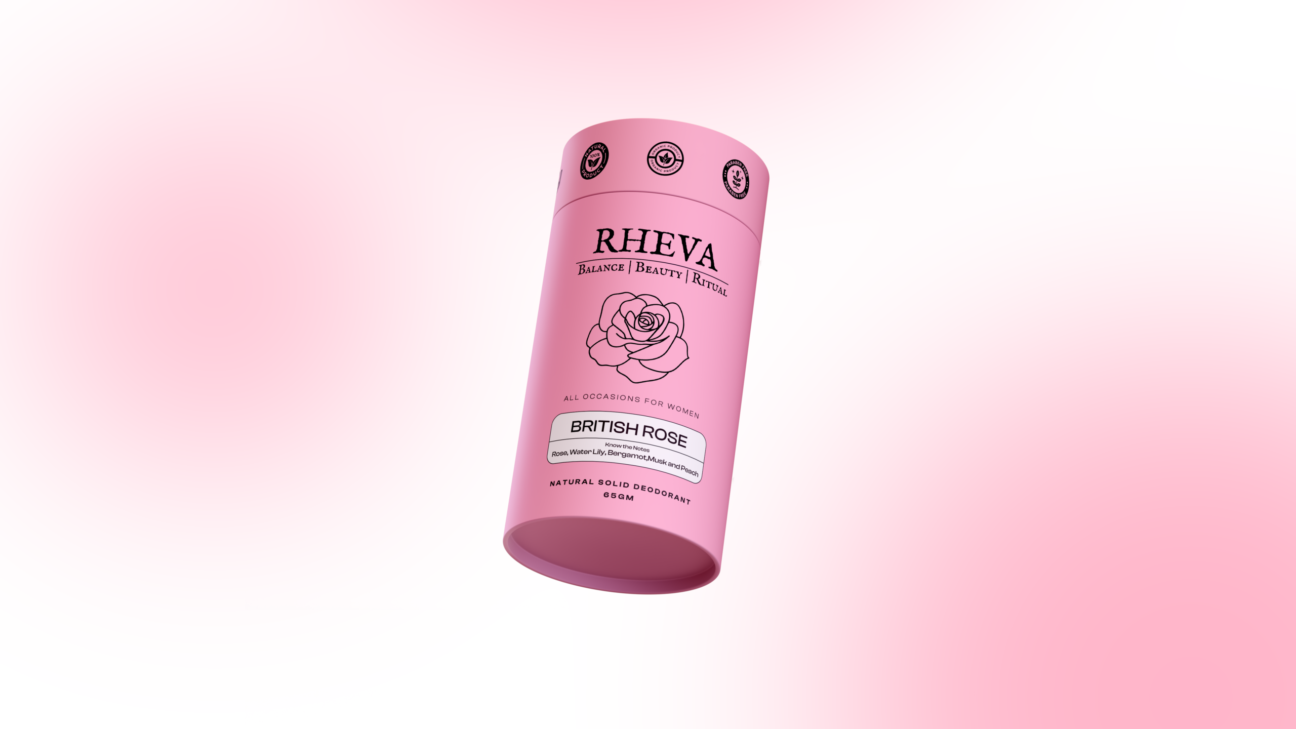
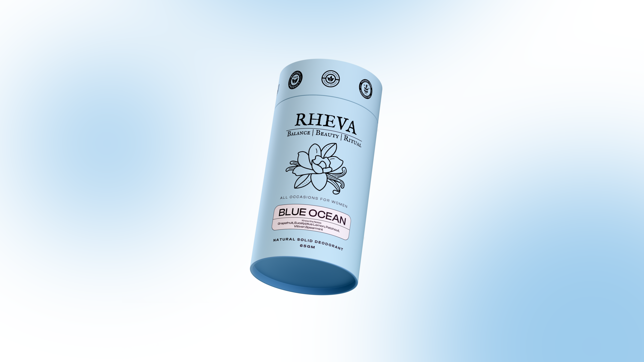
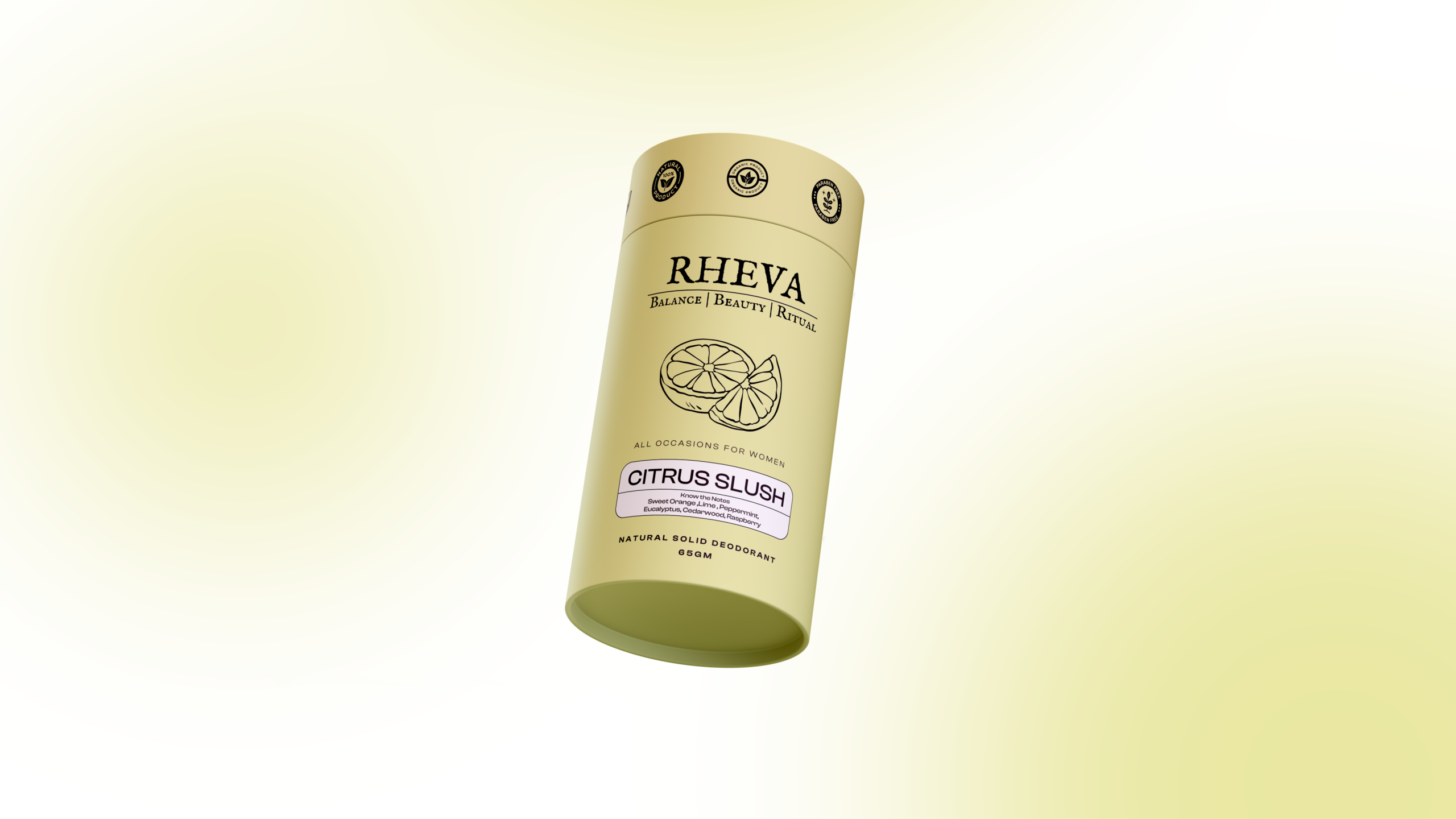
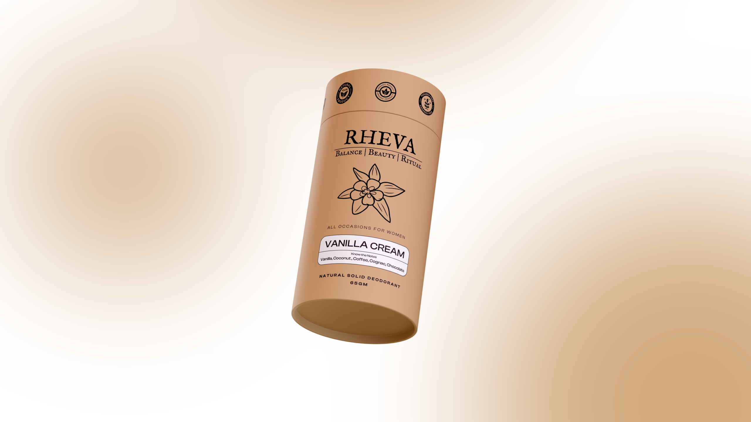
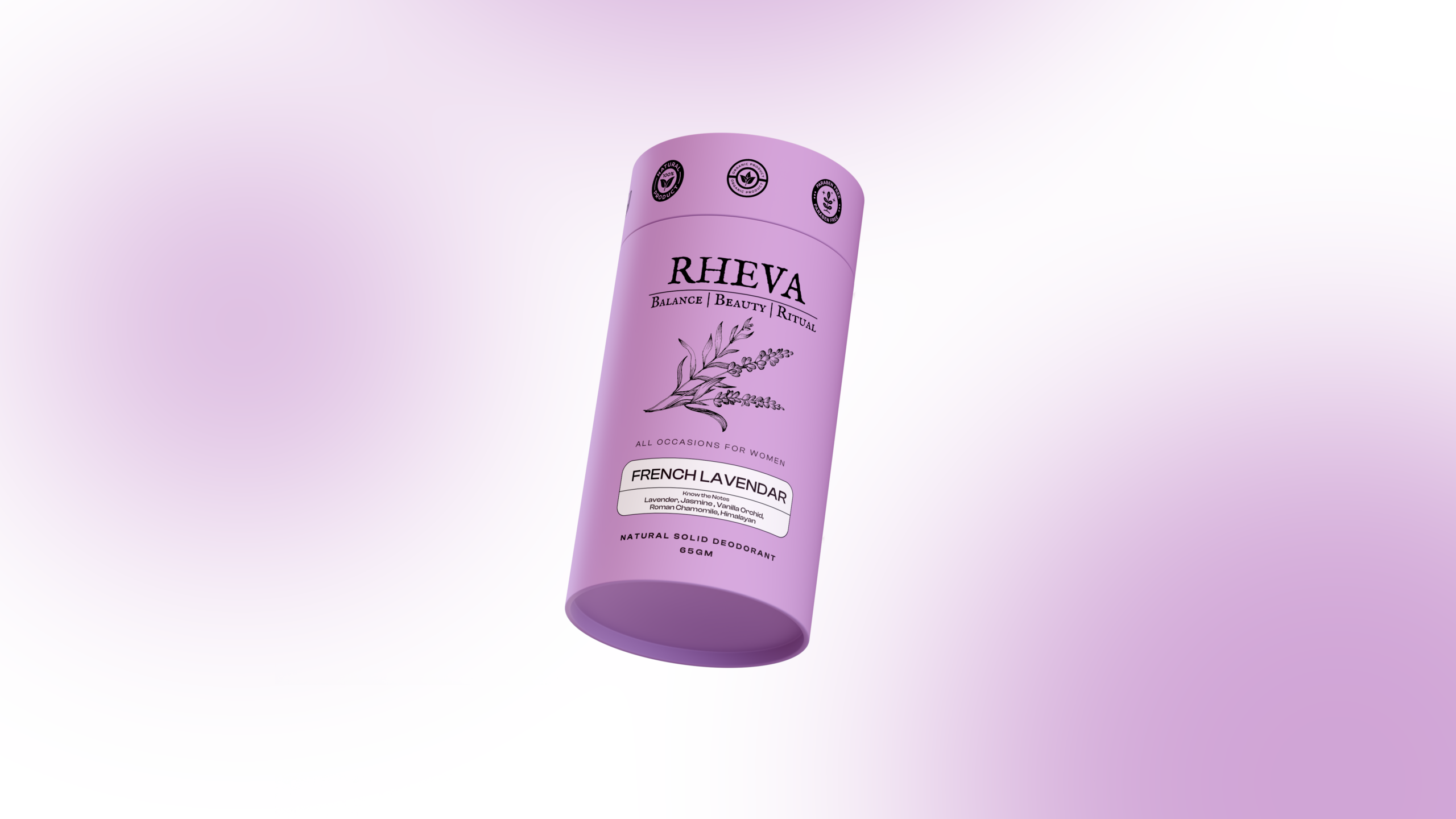
RHEVA is a deodorant brand rebranding project focused on refreshing and elevating its packaging design for a more contemporary market presence. The project involved reimagining the visual direction of the deodorant range while retaining the brand’s core identity and product recognition. The new packaging was designed to communicate freshness, confidence, energy, and everyday sophistication through a more refined visual language. Each design element was carefully considered to create a cohesive and appealing product range that feels modern both on shelves and across digital platforms.
The challenge was to modernize RHEVA’s existing deodorant packaging while maintaining enough familiarity for existing customers to recognize the brand. The packaging needed to stand out within a highly competitive personal-care market where visual impact plays an important role in purchase decisions. Another key challenge was creating differentiation between individual deodorant variants while keeping the entire range visually connected. The design also needed to balance freshness and youthful energy with a polished and premium appearance.
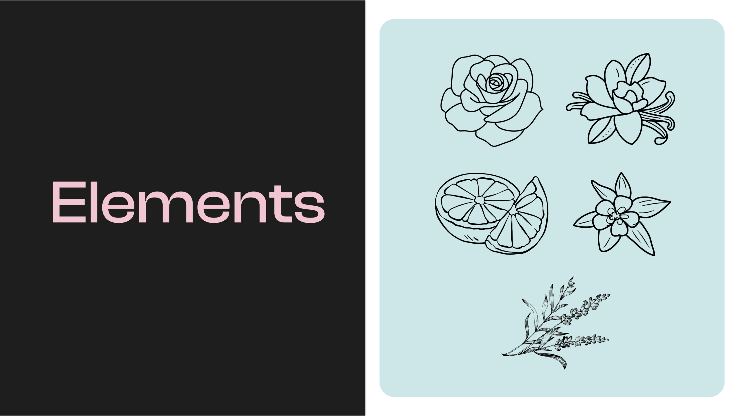
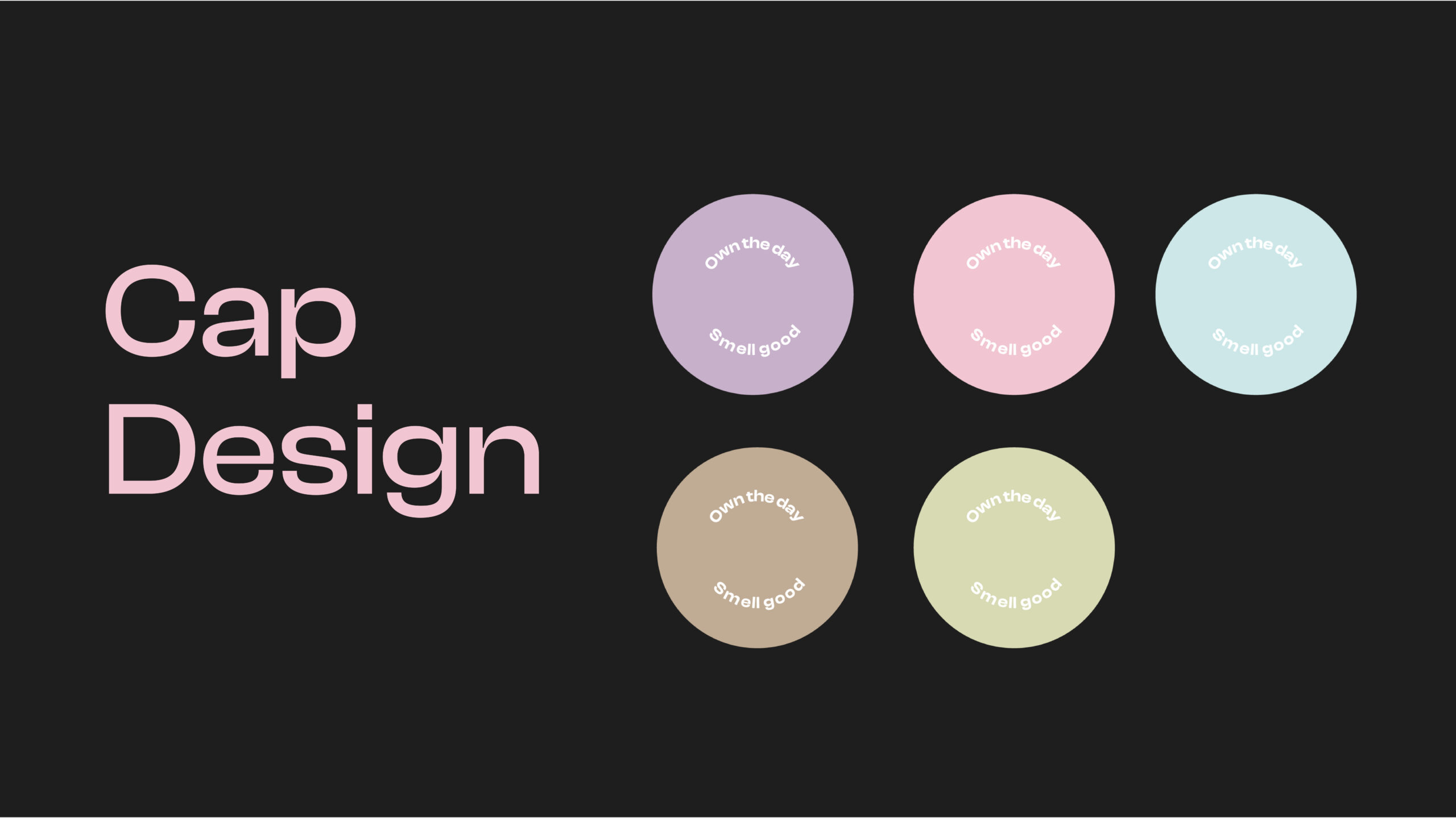
We redesigned RHEVA’s deodorant packaging with a refreshed visual system focused on clarity, freshness, and contemporary appeal. The new direction brought together typography, color, graphic elements, product information, and layout into a consistent packaging language across the range. Each variant was given its own distinctive visual character while following the same overall design framework for strong shelf recognition. The result is a more confident and modern packaging identity that gives RHEVA a stronger presence within the personal-care category.
© 2026 Kohinoor Studios — Crafted with purpose, designed to be remembered.