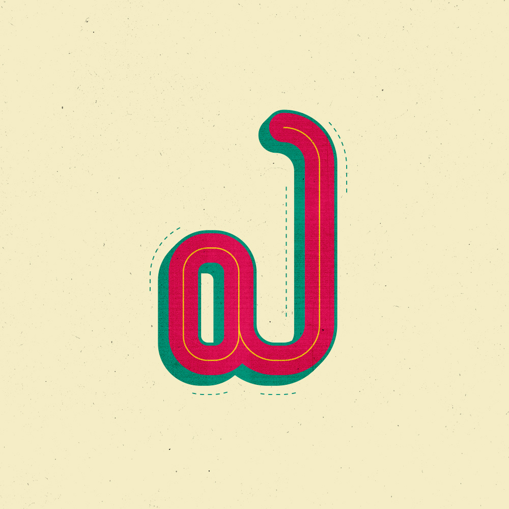
Telugu Letters
Creative Strategy
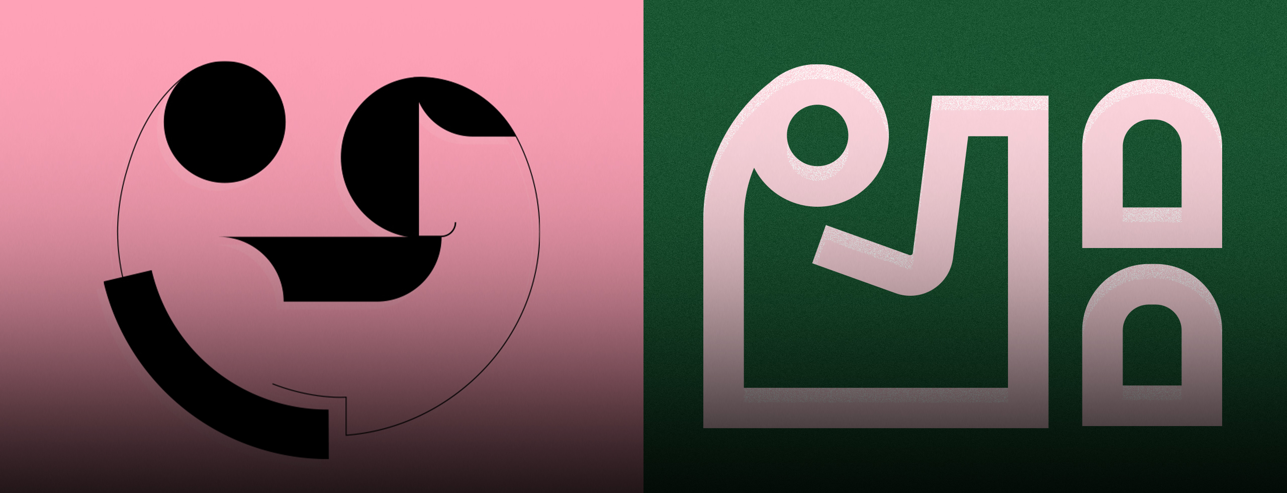
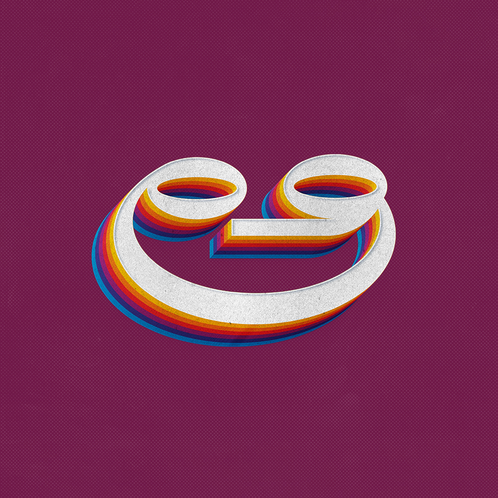
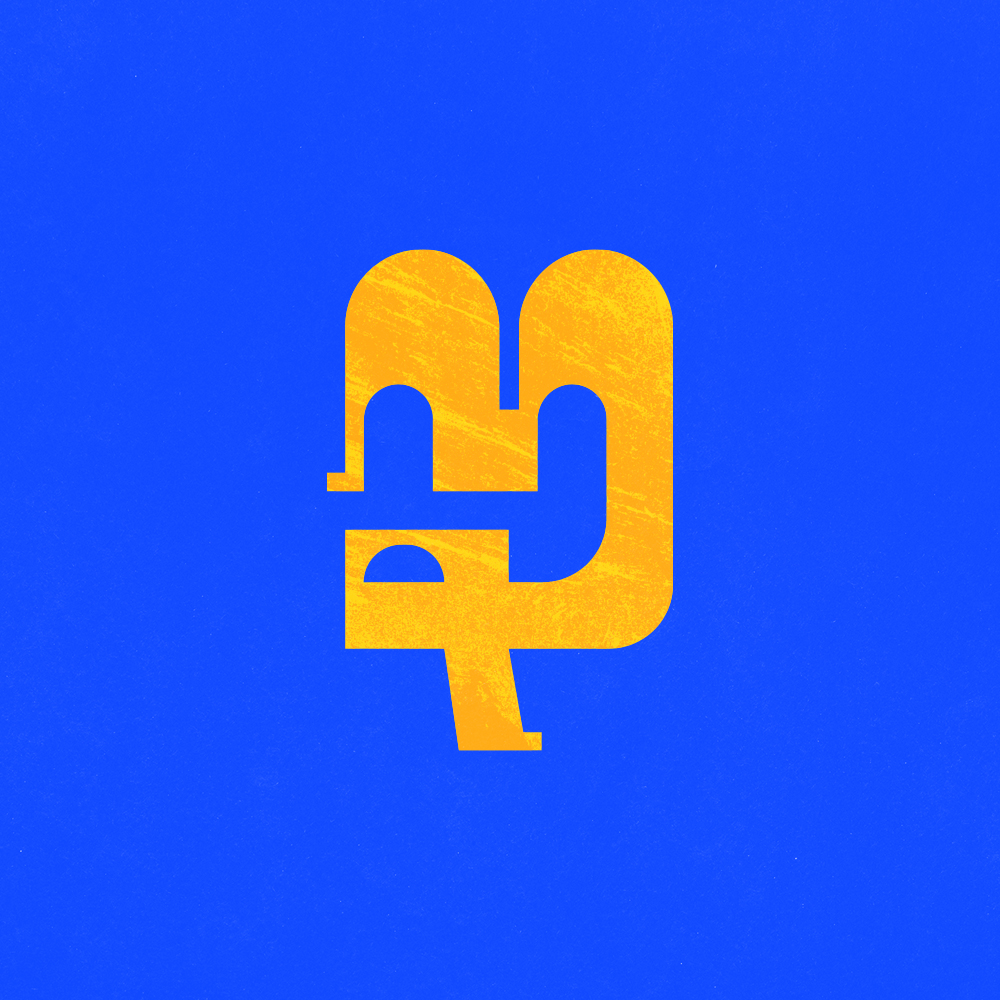
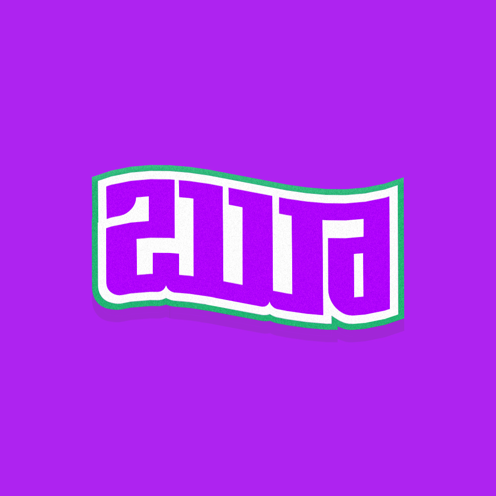
Telugu Letters is an experimental typography project that explores the visual beauty, structure, and cultural character of the Telugu script through a contemporary design approach. The project looks beyond the conventional use of Telugu as a writing system and treats each letterform as an individual piece of visual art. By combining distinctive Telugu curves with bold compositions, geometric forms, textures, layering, and expressive color palettes, the project creates a collection of unique interpretations that feel both culturally rooted and visually modern. Each artwork focuses on the personality of the letter, exploring how typography can communicate emotion, movement, and identity even without relying on words or sentences. The project aims to create a bridge between the traditional aesthetics of Telugu lettering and modern graphic design, presenting the script in a way that feels fresh, experimental, and engaging for contemporary audiences.
The primary challenge was to reinterpret Telugu letterforms in a modern and visually compelling way without losing their original identity and cultural essence. Telugu characters have distinctive rounded structures, curves, proportions, and visual relationships that can easily become distorted when transformed into experimental graphic elements. The challenge was therefore to maintain the recognizability and character of each letter while introducing unconventional compositions, textures, colors, and graphic treatments. Another important consideration was creating designs that felt consistent as a collection while allowing every individual letter to have its own personality and visual expression. The work needed to balance cultural authenticity, typography, creativity, readability, and contemporary aesthetics without making the designs feel overly traditional or purely decorative.
The solution was to approach each Telugu letter as an independent visual identity and build a unique composition around its fundamental form. Instead of simply changing fonts or applying effects, the letterforms were carefully simplified, reshaped, layered, and combined with geometric elements to create distinctive graphic symbols. Different color combinations, textured surfaces, shadows, depth effects, and backgrounds were introduced to give each composition its own character while maintaining a unified visual language across the collection. The designs preserve the recognizable structure of the Telugu script while allowing the forms to become more expressive and experimental. Through this approach, Telugu Letters transforms familiar characters into contemporary visual artworks, demonstrating how regional typography can be reinterpreted through modern graphic design while continuing to retain its cultural identity and connection to the Telugu language.
© 2026 Kohinoor Studios — Crafted with purpose, designed to be remembered.